When creating graphics to share with stakeholders, it is important to consider key graphic design principles. These principles help ensure that the visuals effectively communicate information while maintaining clarity and transparency:
Simplicity: Keep the design clean, uncluttered, and visually straightforward. Use minimalistic and intuitive elements that allow stakeholders to focus on the data without distractions.
Consistency: Maintain a consistent visual style throughout your graphics, including colors, fonts, and icons. Consistency helps stakeholders easily understand and interpret the information presented.
Visual Hierarchy: Arrange elements based on their importance and relevance. Use visual cues such as size, color, and position to guide stakeholders’ attention and emphasize key data points.
Clear Typography: Choose legible fonts and font sizes that ensure readability. Use typography strategically to highlight key findings or data points while maintaining overall coherence.
Color Palette: Employ a cohesive color scheme that is visually appealing and enhances data comprehension. Ensure that color choices align with the intended message and accurately represent the underlying data.
Data Visualization: Select appropriate chart types, such as bar graphs, pie charts, or line graphs, based on the nature of the data. Use effective data visualization techniques to present complex information in a clear and accessible manner.
Labeling and Annotation: Provide clear labels, titles, and annotations to help stakeholders understand the context and meaning of the data. Avoid ambiguity and provide necessary explanations to maintain transparency.
Data Accuracy and Transparency: Ensure that the data used in the graphics is accurate, up-to-date, and transparently sourced. Clearly cite the data origins and provide contextual information to promote trust and credibility.
By incorporating these graphic design principles, you can create visually appealing graphics that effectively communicate data to stakeholders while upholding transparency and facilitating easy comprehension and interpretation of the information presented.
Installing Poppins
Your computer may not have the Poppins font installed. If it is not installed, please install the free Poppins font from Google. Below are step by step instructions:
Download the Poppins font (as a zip file). Unzip the file on your computer. For each .ttf file in the unzipped Poppins/ folder, double click the file and click Install (on Windows) or Install Font (on Mac). You only need to install Lato once per computer.
Scatter Plots
One-Color Scatter PLot
Scatter plots are useful for visualizing the relationship between two variables, identifying patterns or trends, and detecting outliers or anomalies.
Reveal Code
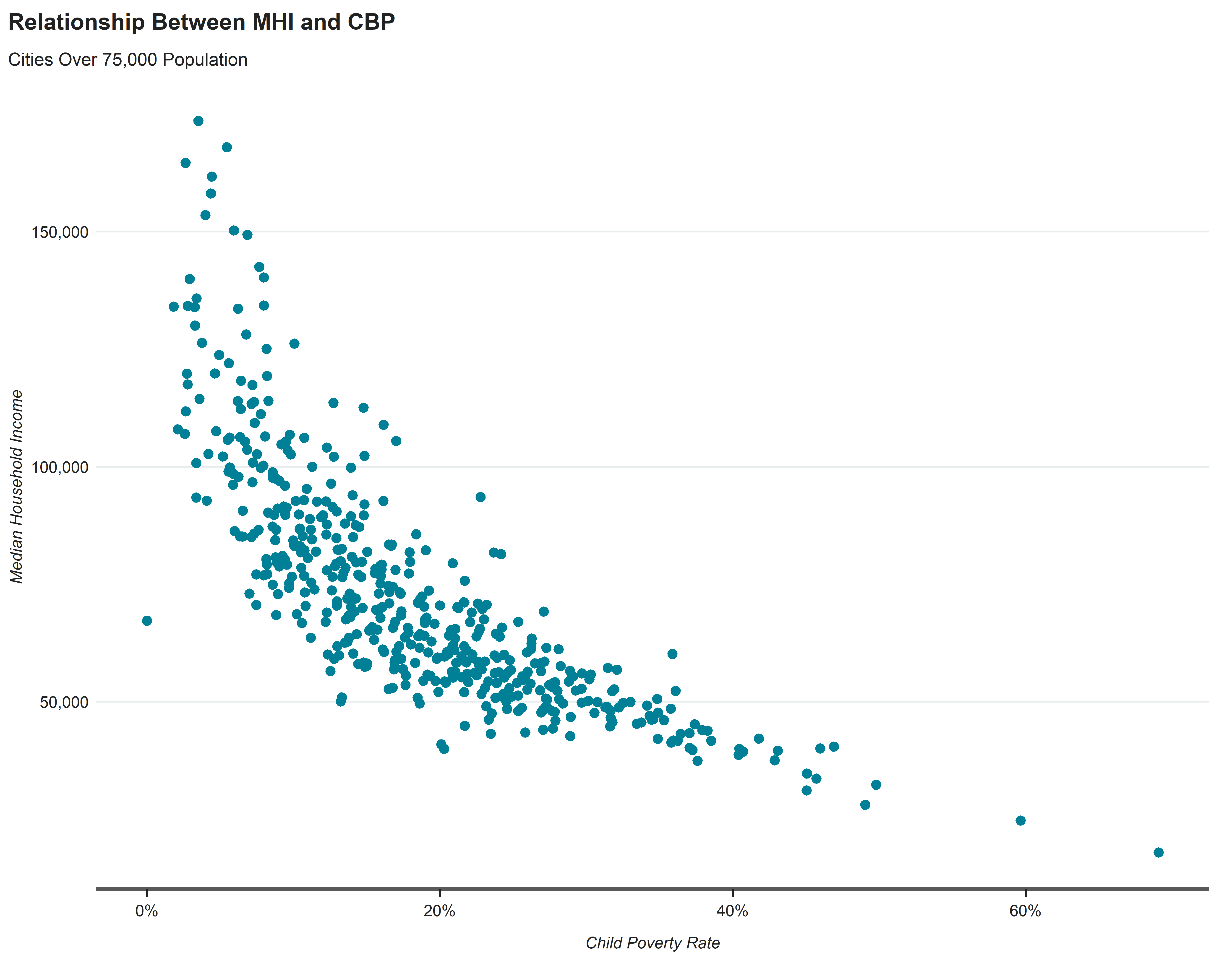
cpal_comp %>%filter(year ==as.Date("2021-01-01")) %>%filter(tot_popE >=75000) %>%ggplot(aes(x=cbp, y=mhiE)) +geom_point(size=2, color ="#008097") +theme_cpal_print() +labs(title ="Relationship Between MHI and CBP",subtitle ="Cities Over 75,000 Population",x ="Child Poverty Rate",y ="Median Household Income") +scale_x_continuous(labels = scales::percent_format()) +# <2> Format scale into percentage.scale_y_continuous(labels = scales::comma) +theme(axis.line =element_line(colour ="#595959", linewidth =1, linetype ="solid"))
A basic scatterplot visualizing a relationship between Child Poverty Rate and Median Household Income in cities with a population greater than 75,000.
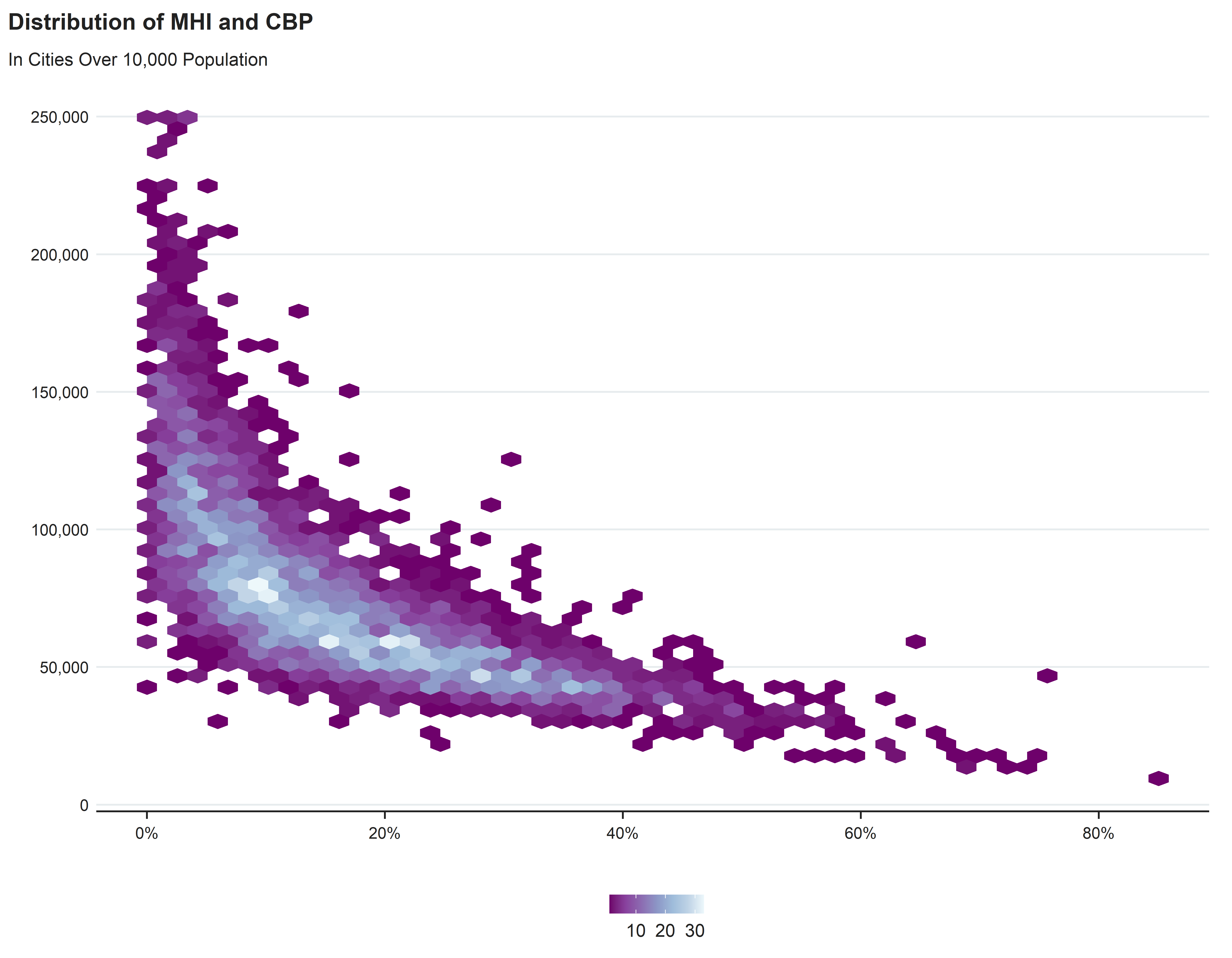
High Density Scatter Plot
Reveal Code
cpal_comp %>%filter(tot_popE >=10000) %>%ggplot(aes(x=cbp, y=mhiE)) +geom_point(alpha =0.05, color ="#008097") +#<1> alpha changes the transparency of points plotted.theme_cpal_print() +labs(title ="Relationship Between MHI and CBP",subtitle ="Cities Over 10,000 Population",x ="Child Poverty Rate",y ="Median Household Income") +scale_x_continuous(labels = scales::percent_format()) +# <2> Format scale into percentage.scale_y_continuous(labels = scales::comma) +theme(axis.line =element_line(colour ="#595959", linewidth =1, linetype ="solid"))
A high density scatterplot visualizing a relationship between Child Poverty Rate and Median Household Income in cities with a population greater than 10,000.
Varying Point Size Scatter Plot
Reveal Code
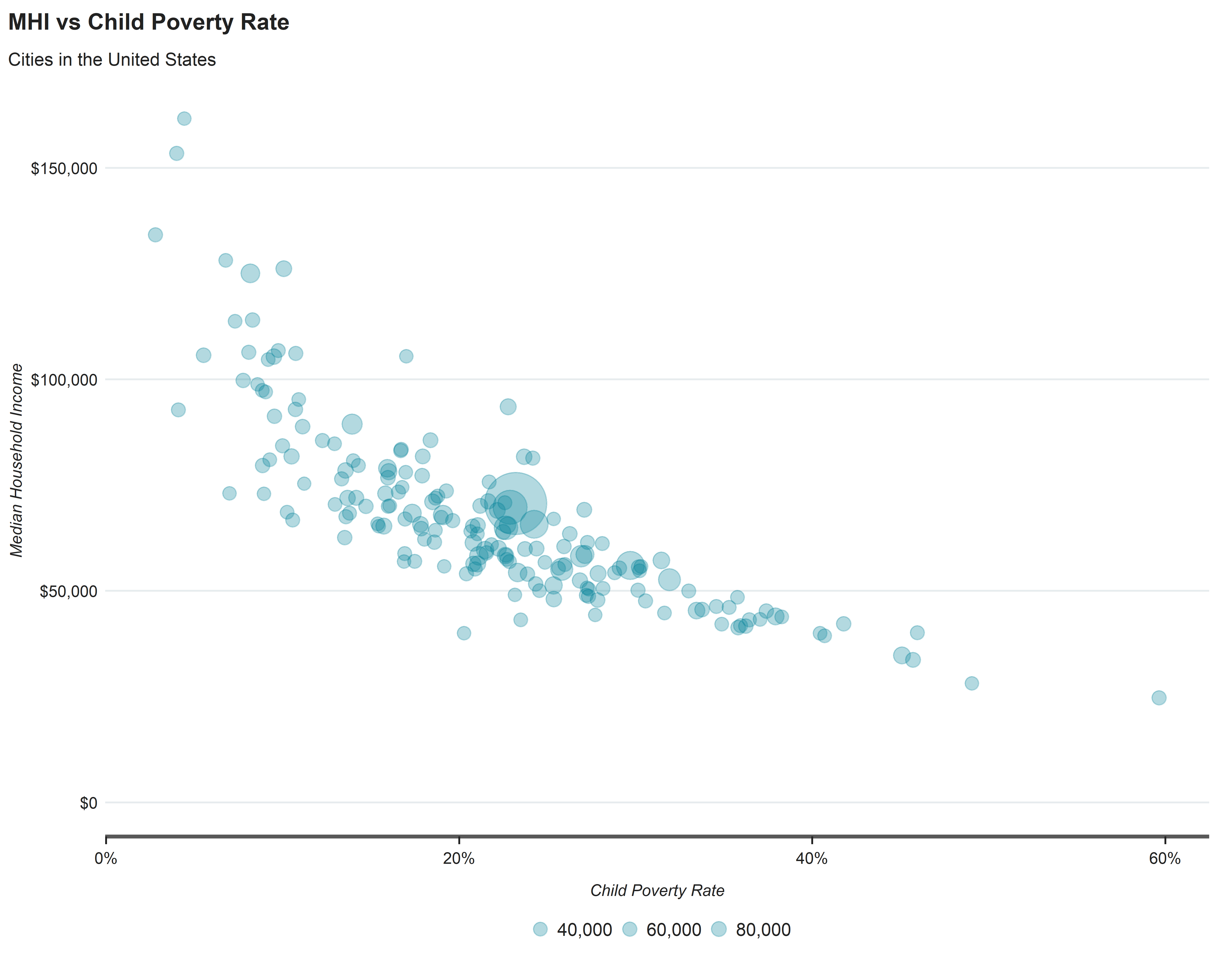
cpal_comp %>%filter(year ==as.Date("2021-01-01")) %>%filter(tot_popE >=150000) %>%ggplot(aes(x=cbp, y=mhiE)) +geom_point(aes(size = pop_u18E), alpha =0.3, color ="#008097") +# <1> size aesthetic can be mapped to a variable in dataframe, but scale_radius will need to be definedscale_radius(range =c(3, 15), breaks =c(20000, 40000, 60000, 80000),labels = scales::comma) +theme_cpal_print() +labs(title ="MHI vs Child Poverty Rate",subtitle ="Cities in the United States",x ="Child Poverty Rate",y ="Median Household Income") +scale_y_continuous(labels = scales::dollar_format(), limits =c(0, NA)) +scale_x_continuous(labels = scales::percent_format()) +theme(axis.line =element_line(colour ="#595959", linewidth =1, linetype ="solid"))
A size adjusted scatterplot visualizing a relationship between Child Poverty Rate and Median Household Income in cities with over a million population with points adjusted based on total number of children below poverty.
Lollipop Chart
Reveal Code
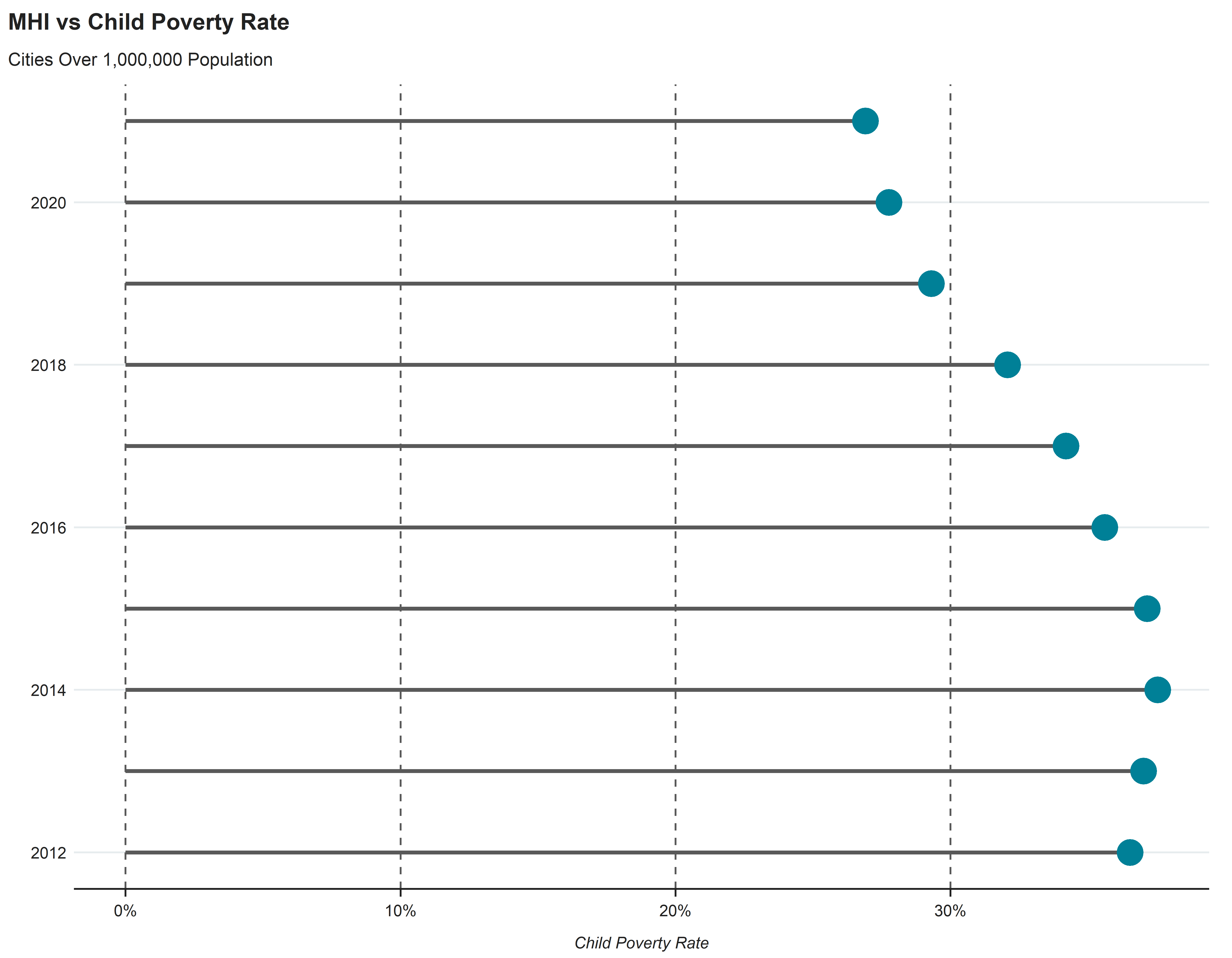
cpal_1mil %>%filter(CODE =="DAL") %>%ggplot(aes(x=year, y=cbp)) +geom_segment(aes(x = year, xend = year, y =0, yend = cbp), color ="#595959", linewidth =1) +geom_point(size=6, color ="#008097") +coord_flip() +theme_cpal_print() +labs(title ="MHI vs Child Poverty Rate",subtitle ="Cities Over 1,000,000 Population",x ="",y ="Child Poverty Rate") +scale_y_continuous(labels = scales::percent_format()) +#+ <2> Format scale into percentage.theme(panel.grid.major.x =element_line(color ="#595959",linewidth =0.5,linetype =2))
A basic scatterplot visualizing a relationship between Child Poverty Rate and Median Household Income in cities with over a million population.
Line Graph
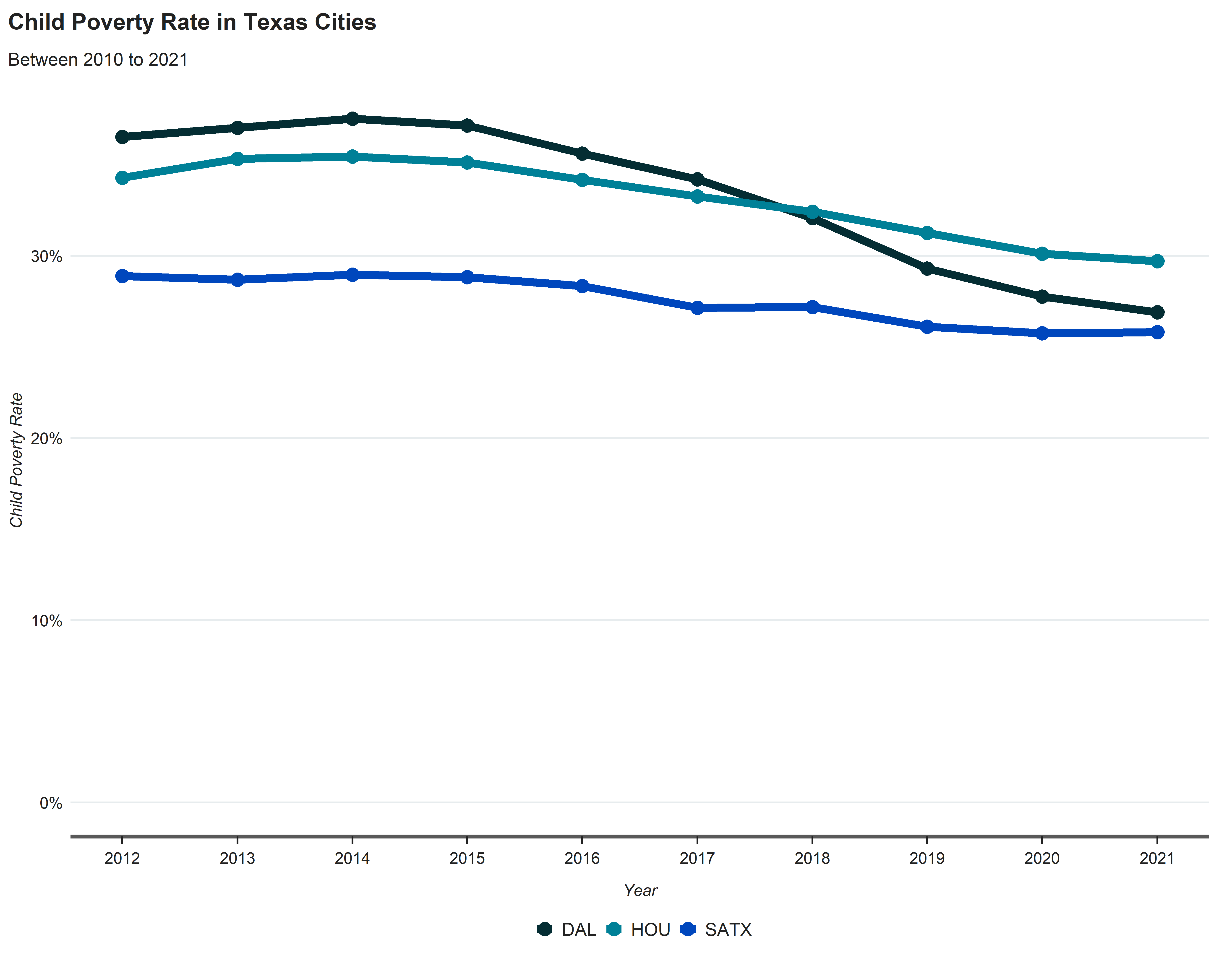
Basic Line Graph
Reveal Code
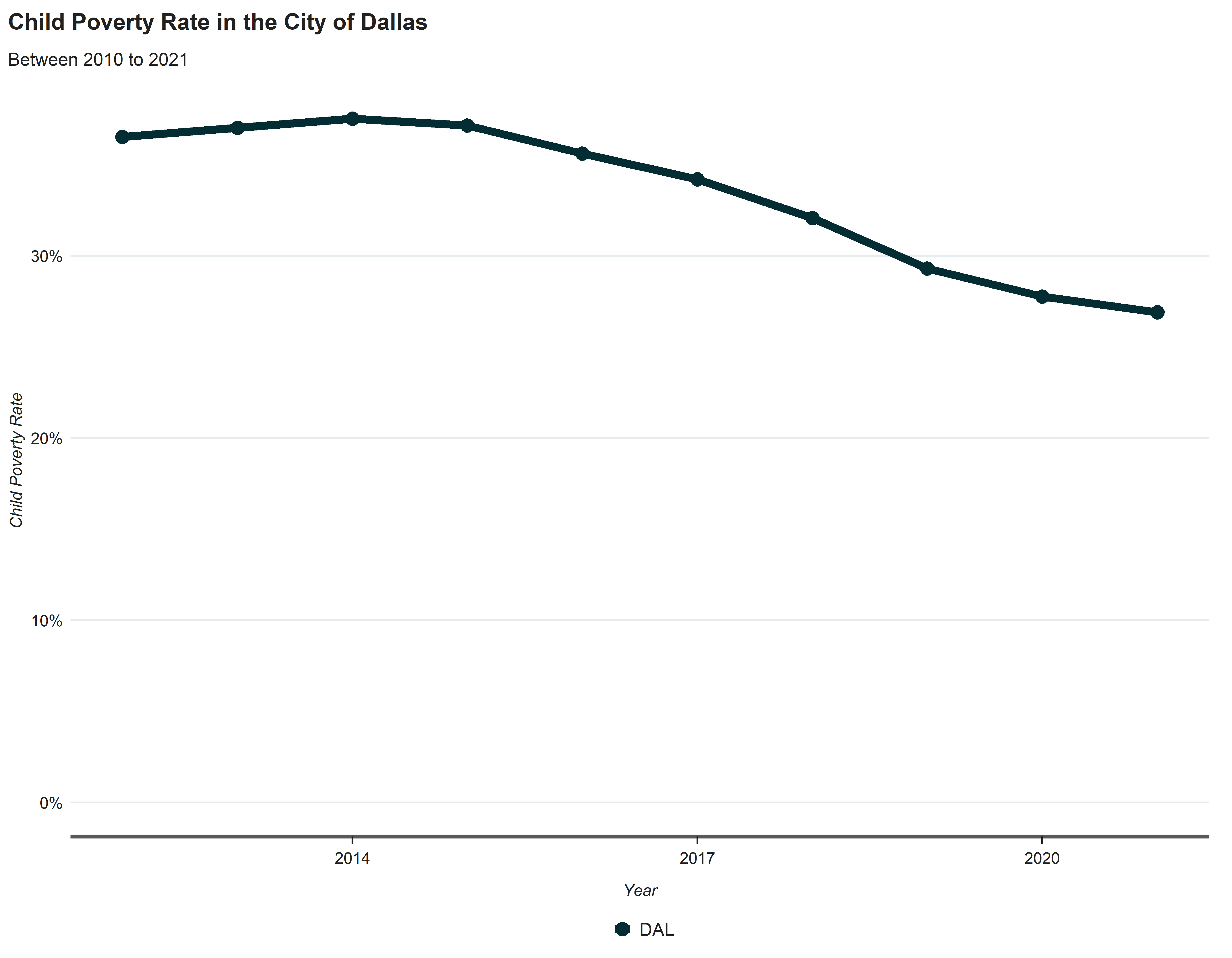
cpal_1mil %>%filter(highlight =="DAL") %>%ggplot(aes(x=year, y=cbp, group = CODE, color = CODE)) +geom_line(size =2) +geom_point(size=3) +theme_cpal_print() +labs(title ="Child Poverty Rate in the City of Dallas",subtitle ="Between 2010 to 2021",x ="Year",y ="Child Poverty Rate") +scale_color_manual(values = palette_cpal_main) +scale_y_continuous(labels = scales::percent_format(), limits =c(0, NA)) +scale_x_date(date_breaks ="3 years", date_labels ="%Y") +theme(axis.line =element_line(colour ="#595959", linewidth =1, linetype ="solid"))
A basic line graph visualizing a the Child Poverty Rate in the City of Dallas
A multiples line graph visualizing the child poverty rate of multiple cities since 2010.
Bar Graphs
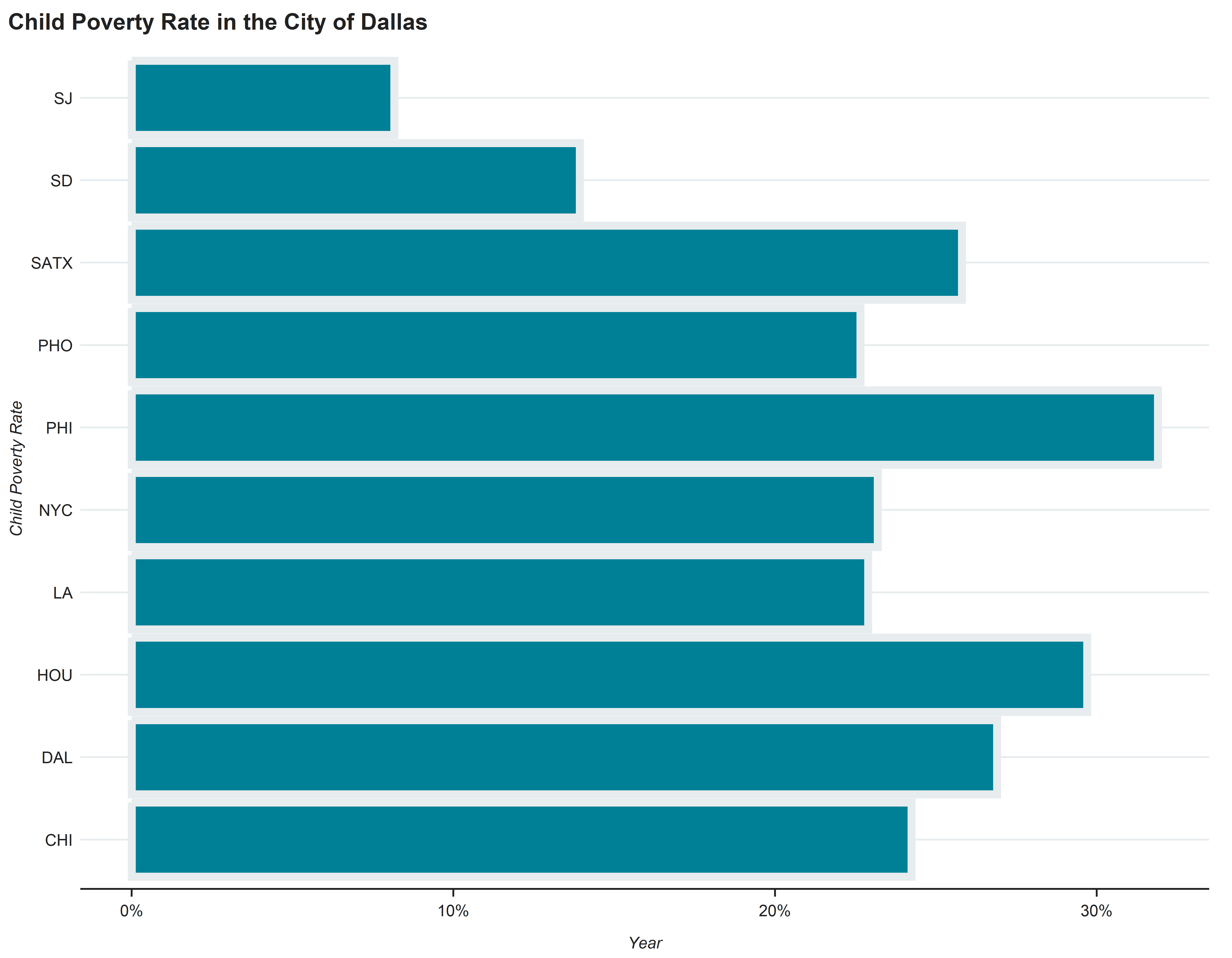
One-Color Bar Graph
Reveal Code
# A basic line graph visualizing a the Child Poverty Rate in the City of Dallascpal_1mil %>%filter(year ==as.Date("2021-01-01")) %>%ggplot(aes(x=cbp, y=CODE)) +geom_bar(stat ="identity", size =2, fill ="#008097", color ="#E7ECEE") +theme_cpal_print() +labs(title ="Child Poverty Rate in the City of Dallas",x ="Year",y ="Child Poverty Rate") +scale_color_manual(values = palette_cpal_main) +scale_x_continuous(labels = scales::percent_format(), limits =c(0, NA))
A basic line graph visualizing a the Child Poverty Rate in the City of Dallas
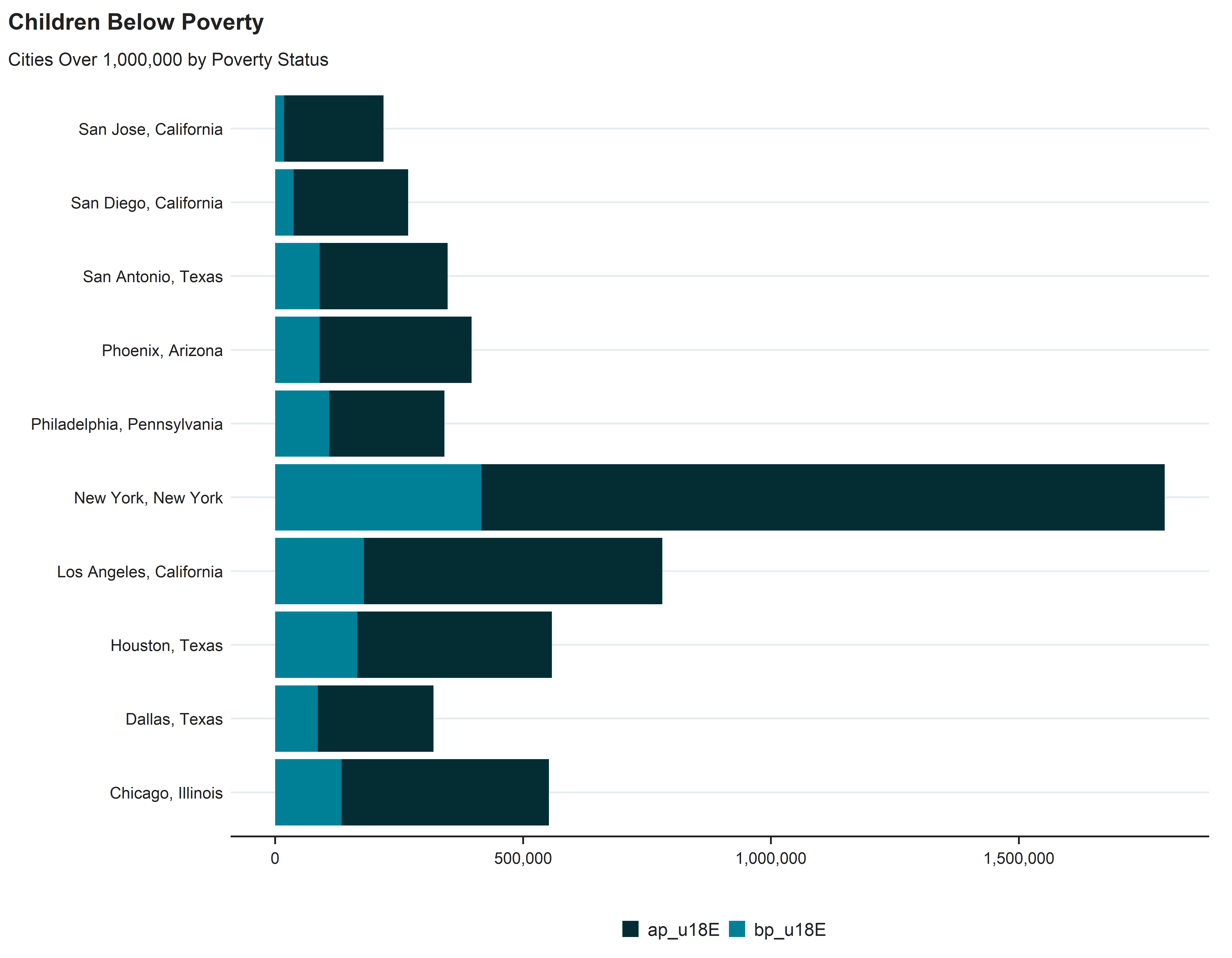
Stacked Bar Plot
Reveal Code
cpal_1mil %>%filter(year ==as.Date("2021-01-01")) %>%mutate(ap_u18E = pop_u18E-bp_u18E) %>%select(NAME, ap_u18E, bp_u18E) %>%pivot_longer(!NAME, names_to ="children", values_to ="estimate") %>%ggplot(aes(x = estimate, y = NAME, fill = children)) +geom_bar(position ="stack", stat ="identity") +theme_cpal_print() +scale_x_continuous(labels = scales::comma) +labs(title ="Children Below Poverty",subtitle ="Cities Over 1,000,000 by Poverty Status",x ="",y ="") +scale_fill_manual(values = palette_cpal_main)
A stacked bar plot comparing Renter and Owner Occupied Households in Large Cities.
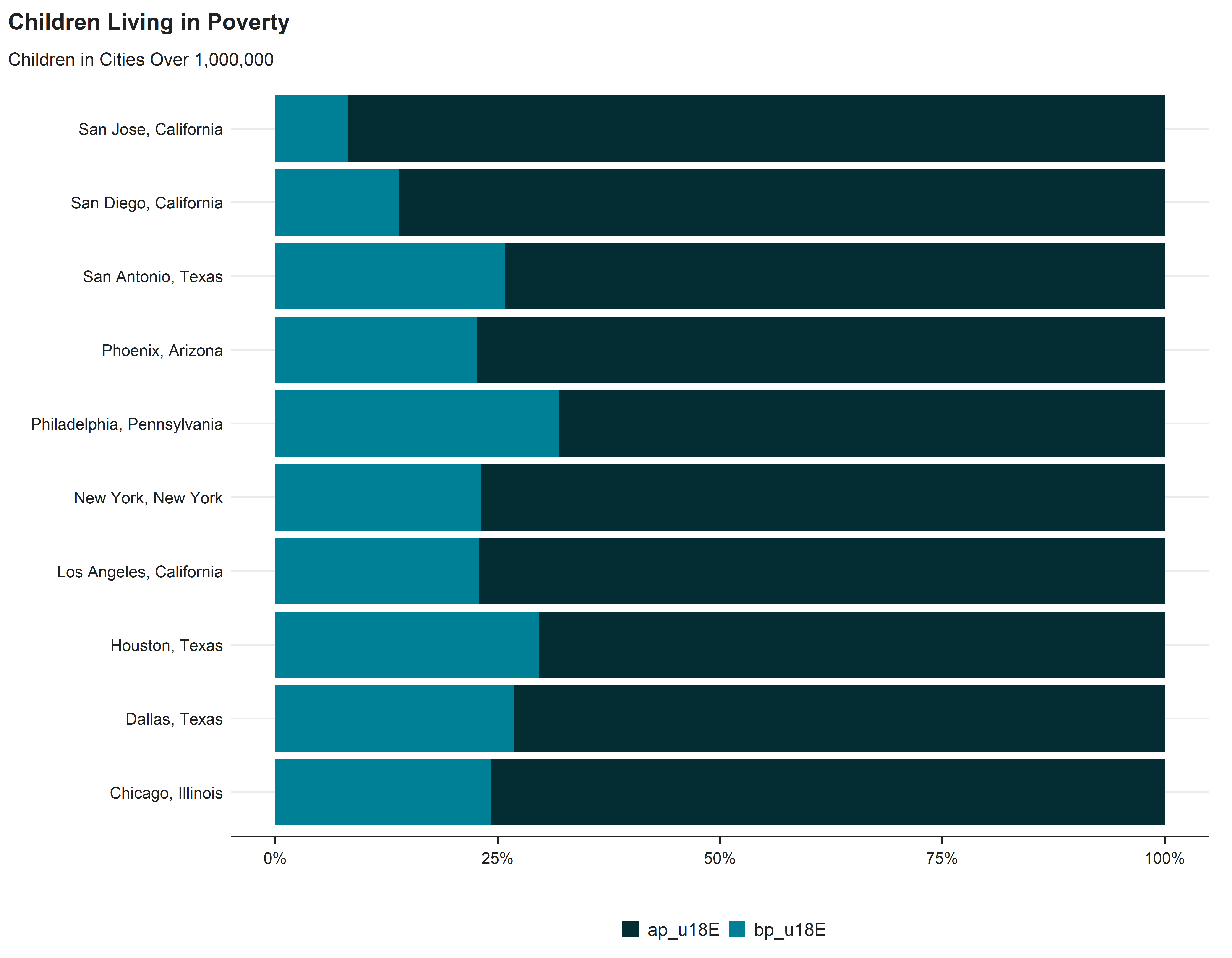
Percent Stacked Bar Plot
Reveal Code
cpal_1mil %>%filter(year ==as.Date("2021-01-01")) %>%mutate(ap_u18E = pop_u18E-bp_u18E) %>%select(NAME, ap_u18E, bp_u18E) %>%pivot_longer(!NAME, names_to ="children", values_to ="estimate") %>%arrange(estimate) %>%ggplot(aes(x = estimate, y = NAME, fill = children)) +geom_bar(position ="fill", stat ="identity") +theme_cpal_print() +scale_x_continuous(labels = scales::percent) +labs(title ="Children Living in Poverty",subtitle ="Children in Cities Over 1,000,000",x ="",y ="") +scale_fill_manual(values = palette_cpal_main)
A stacked bar plot comparing Renter and Owner Occupied Households in Large Cities.
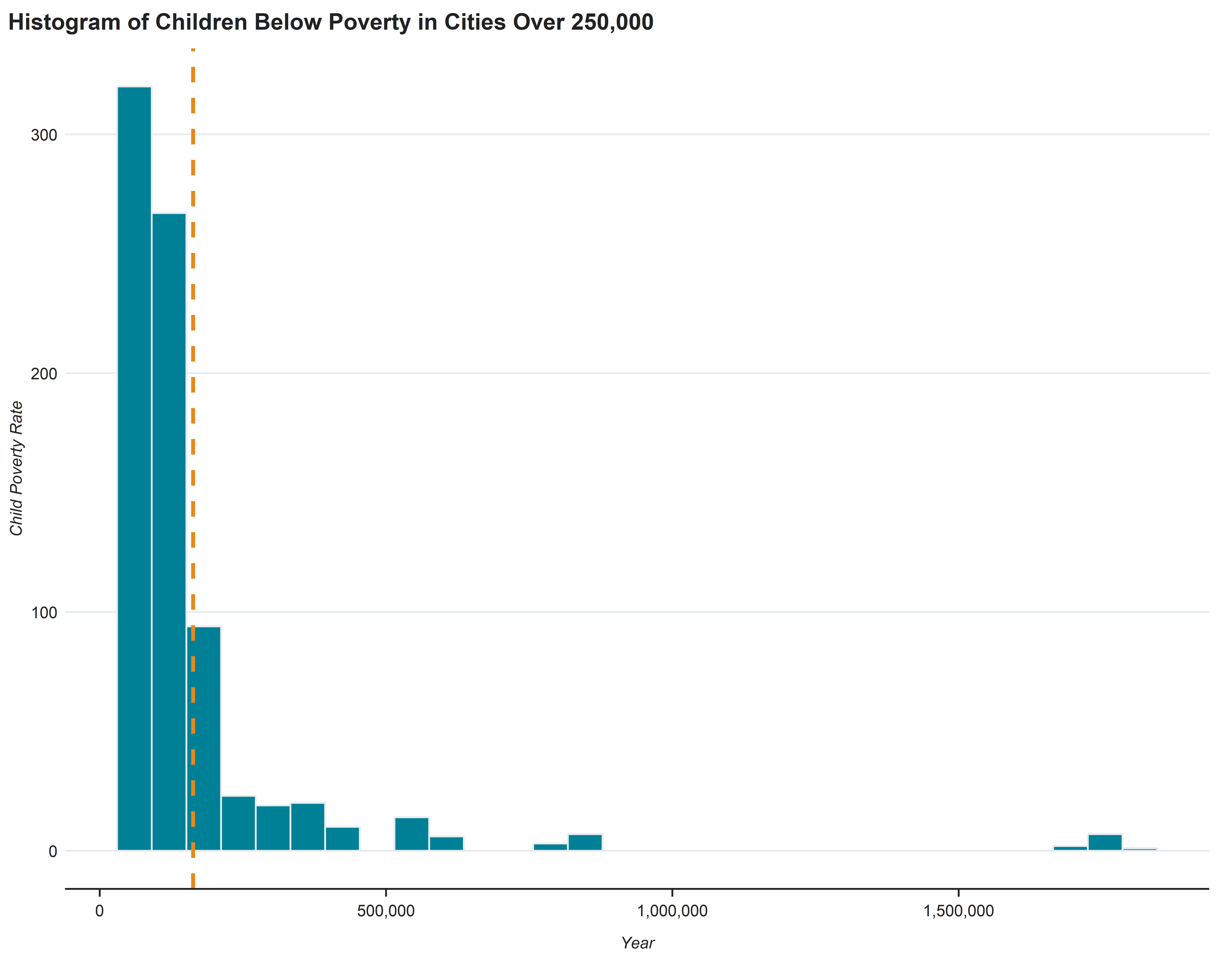
Histogram
Reveal Code
# A basic line graph visualizing a the Child Poverty Rate in the City of Dallascpal_comp %>%filter(tot_popE >=250000) %>%ggplot(aes(x = pop_u18E)) +geom_histogram(colour="#E7ECEE", fill="#008097") +geom_vline(aes(xintercept =mean(pop_u18E)), color="#E98816", linetype="dashed", size=1) +theme_cpal_print() +scale_x_continuous(labels = scales::comma) +labs(title ="Histogram of Children Below Poverty in Cities Over 250,000",x ="Year",y ="Child Poverty Rate")