# At the top of your script
set_theme_cpal()Themes & Styling
Data visualization theming for ggplot2 and Highcharter
cpaltemplates provides consistent theming functions to ensure all CPAL data visualizations maintain brand consistency across reports, dashboards, and presentations. These functions handle typography, colors, gridlines, and branding elements so you can focus on the data story.
General guidance:
- Use ggplot2 when your audience will view a fixed image (printed reports, PowerPoint slides, static web pages)
- Use Highcharter when users benefit from interactivity (tooltips, zoom, filter, download)
Comprehensive Examples
For chart-specific examples with full code, see the ggplot2 Gallery and Highcharter Gallery.
ggplot2 Themes
ggplot2 is the standard for static visualizations in R. Its grammar of graphics approach makes it highly customizable while producing publication-quality output suitable for print and digital formats.
Setting the Theme Globally
Set a CPAL theme once at the top of your script so all subsequent plots use it automatically:
You can also set a specific variant:
# Use dark theme for entire session
set_theme_cpal("dark")

# Reset to ggplot2 default when done
theme_set(theme_gray())
Available Theme Variants
cpaltemplates provides 6 theme variants optimized for different use cases. Each theme maintains CPAL branding while serving specific output contexts. Choose the theme that best matches your visualization’s destination and purpose.
theme_cpal() - Default
The primary CPAL theme for general-purpose visualizations. Features horizontal gridlines, clean typography, and a balanced layout suitable for reports, dashboards, and presentations. Use this as your starting point for most visualizations.
Show code
p <- ggplot(mtcars, aes(x = wt, y = mpg, color = factor(cyl))) +
  geom_point(size = 3) +
  scale_color_cpal() +
  labs(title = "Default Theme", subtitle = "General-purpose visualizations", color = "Cylinders") +
  theme_cpal()

add_cpal_logo(p)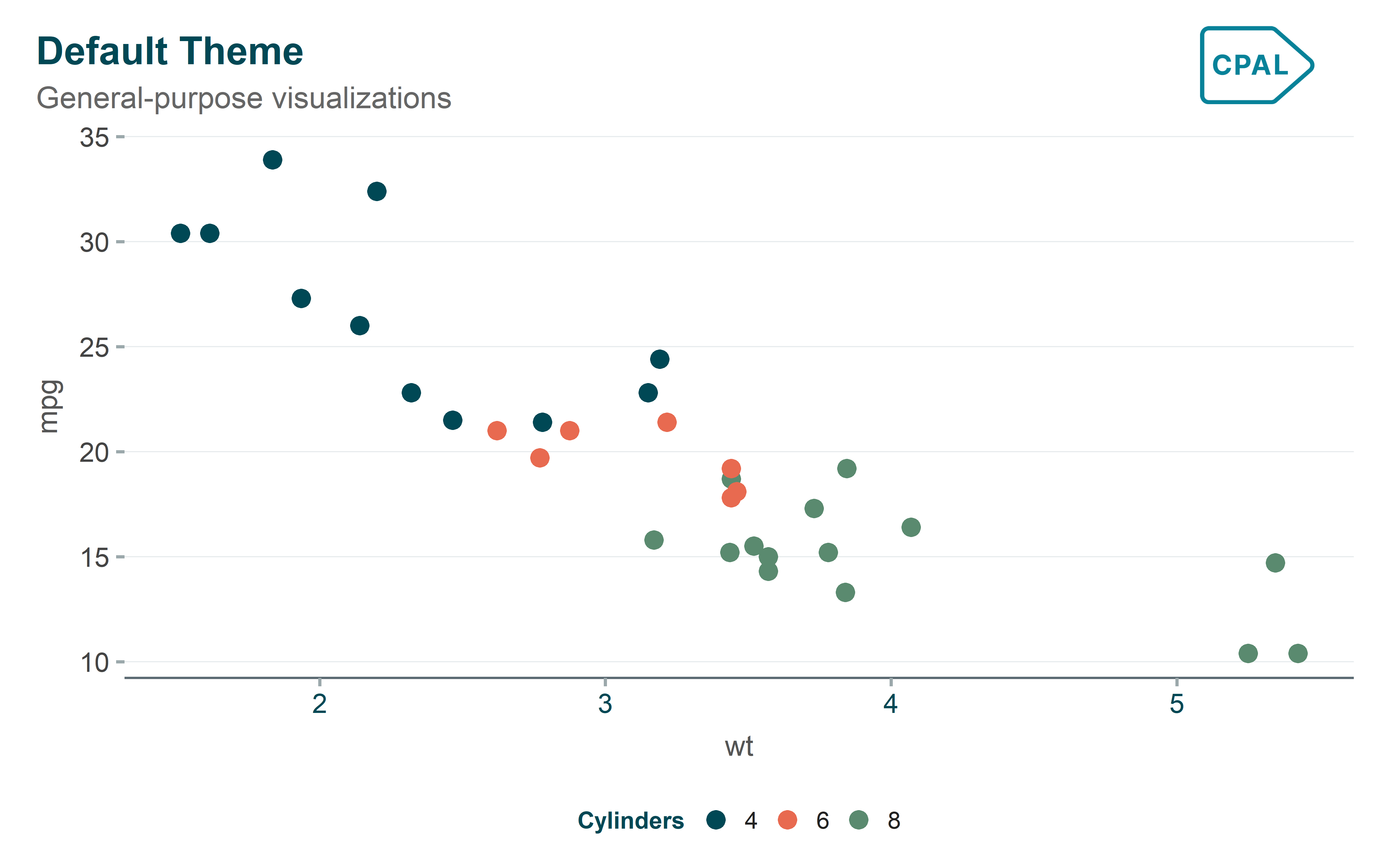
theme_cpal_minimal() - Clean & Simple
A streamlined theme with reduced visual elements for distraction-free presentations. Removes unnecessary gridlines and chrome to let the data speak for itself. Ideal for executive summaries and slide decks where simplicity is paramount.
Show code
p <- ggplot(mtcars, aes(x = wt, y = mpg, color = factor(cyl))) +
  geom_point(size = 3) +
  scale_color_cpal() +
  labs(title = "Minimal Theme", subtitle = "Clean, distraction-free", color = "Cylinders") +
  theme_cpal_minimal()

add_cpal_logo(p)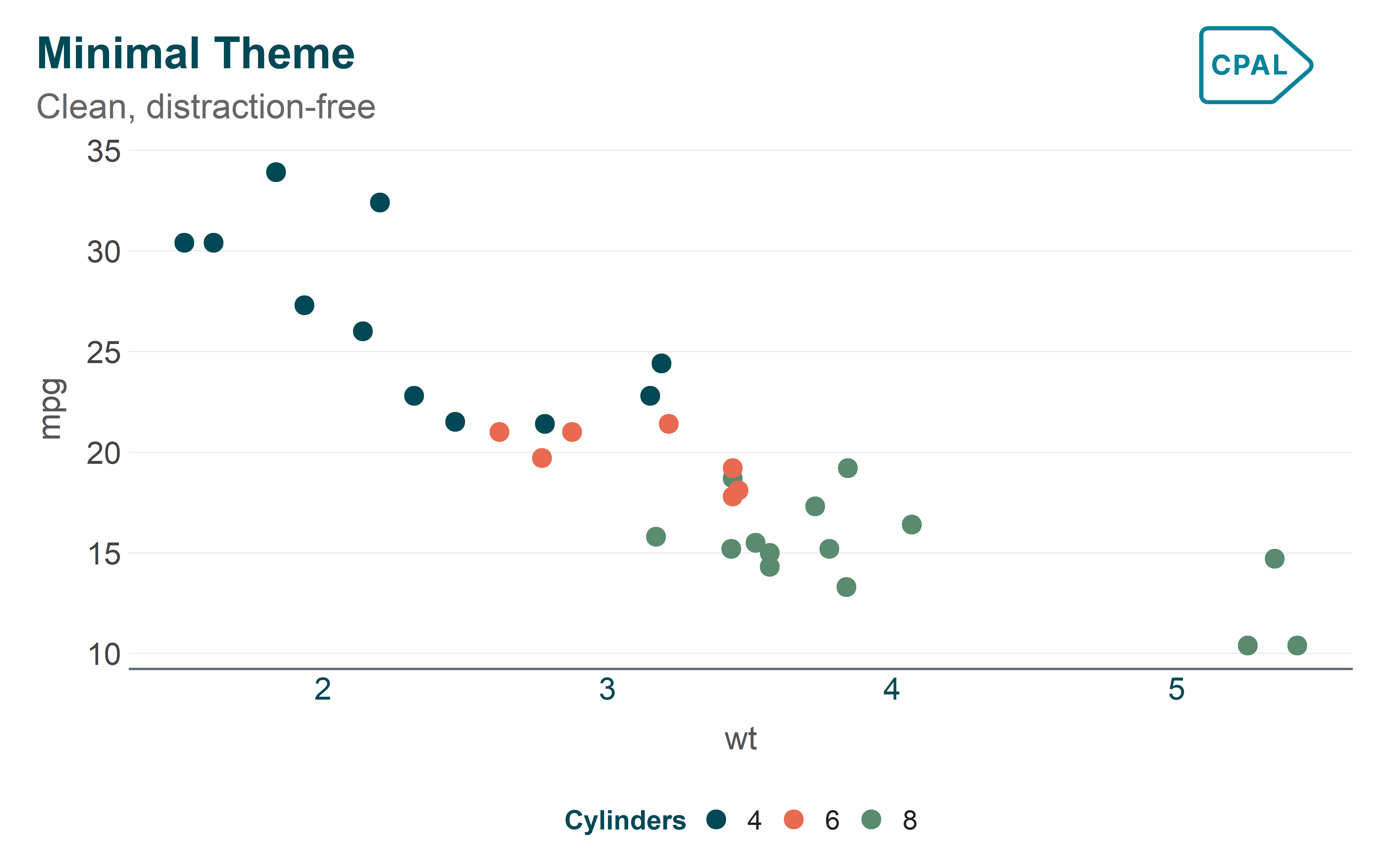
theme_cpal_classic() - Traditional
A traditional theme with axis lines on both axes, following academic and scientific publication conventions. Best suited for research papers, technical reports, and audiences expecting conventional chart styling.
Show code
p <- ggplot(mtcars, aes(x = wt, y = mpg, color = factor(cyl))) +
  geom_point(size = 3) +
  scale_color_cpal() +
  labs(title = "Classic Theme", subtitle = "Traditional with axis lines", color = "Cylinders") +
  theme_cpal_classic()

add_cpal_logo(p)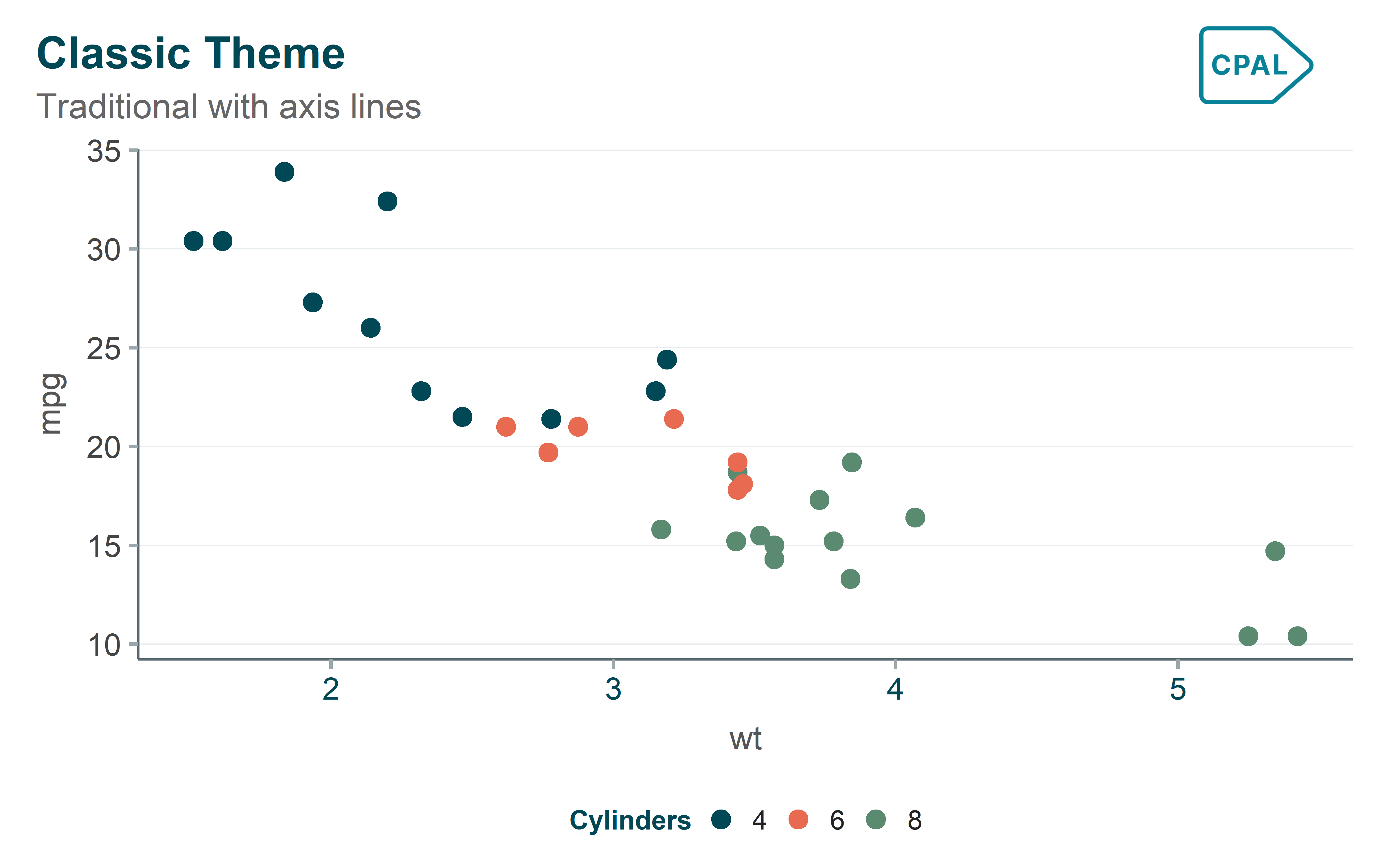
theme_cpal_dark() - Dark Mode
Optimized for dark backgrounds with light text and adjusted colors for readability. Perfect for presentations in dimmed rooms, dark-themed dashboards, and digital displays where dark mode reduces eye strain.
Show code
p <- ggplot(mtcars, aes(x = wt, y = mpg, color = factor(cyl))) +
  geom_point(size = 3) +
  scale_color_cpal() +
  labs(title = "Dark Theme", subtitle = "Presentations and dark mode", color = "Cylinders") +
  theme_cpal_dark()

add_cpal_logo(p)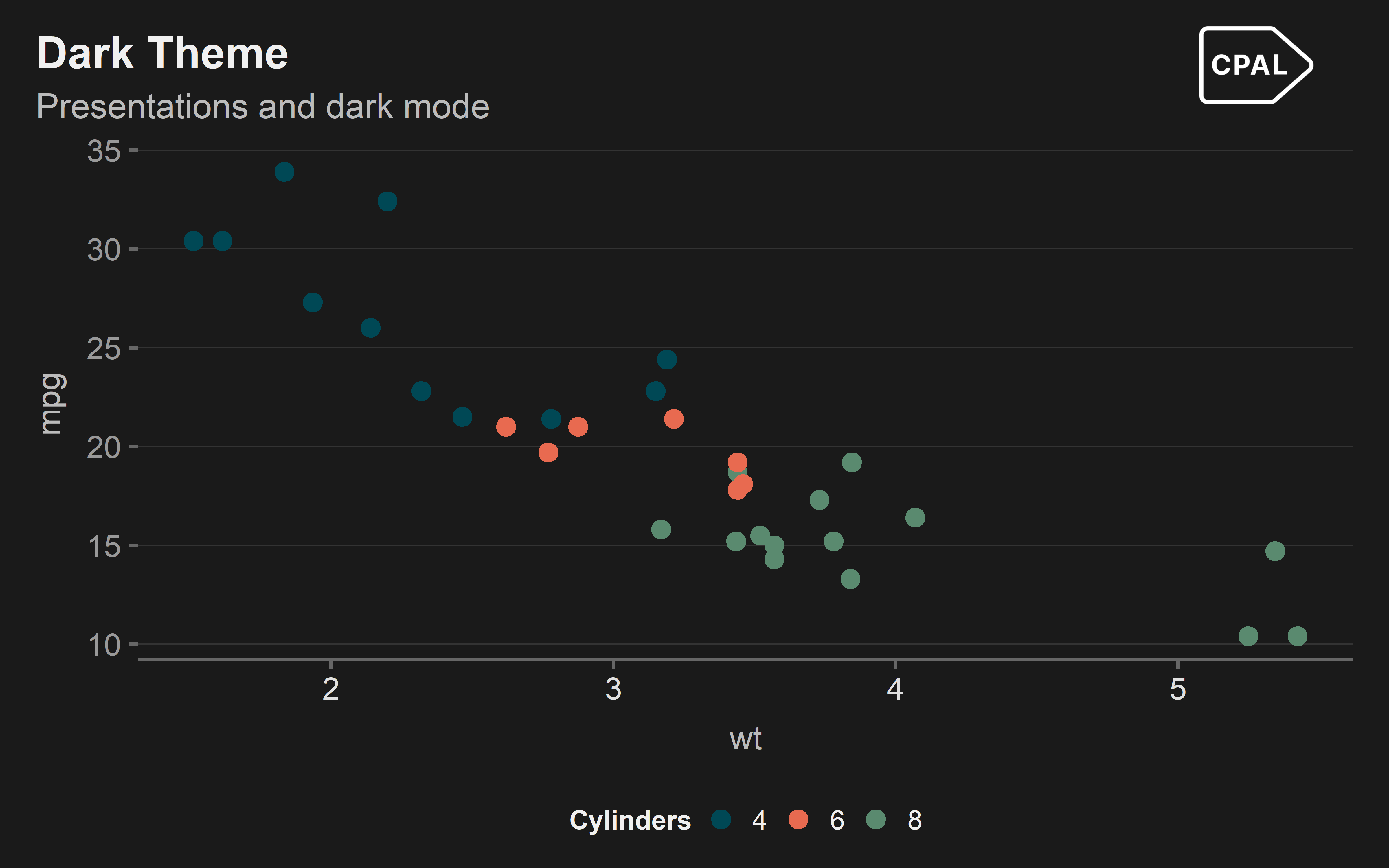
theme_cpal_print() - Print Optimized
A high-contrast theme designed specifically for printed materials and PDFs. Uses darker lines and increased contrast to ensure legibility when printed in black and white or on lower-quality paper.
Show code
p <- ggplot(mtcars, aes(x = wt, y = mpg, color = factor(cyl))) +
  geom_point(size = 3) +
  scale_color_cpal() +
  labs(title = "Print Theme", subtitle = "Optimized for print output", color = "Cylinders") +
  theme_cpal_print()

add_cpal_logo(p)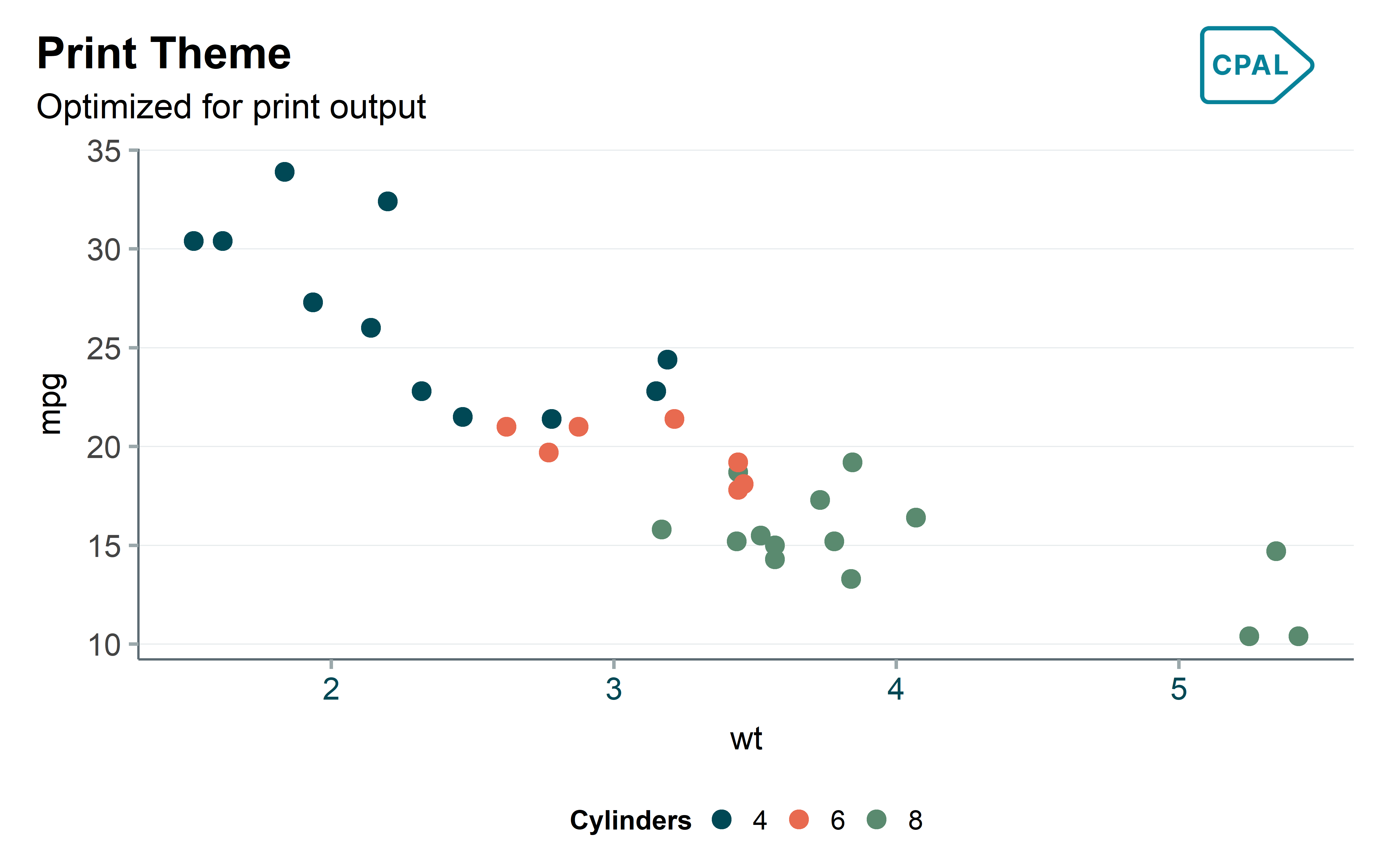
theme_cpal_map() - Geographic
A minimal theme specifically designed for geographic visualizations. Removes axes, gridlines, and panel borders to let map polygons and spatial data take center stage. Essential for choropleth maps and spatial analysis.
Show code
# Get US states data
us_states <- map_data("state")

p <- ggplot(us_states, aes(x = long, y = lat, group = group)) +
  geom_polygon(fill = "#006878", color = "white", linewidth = 0.3) +
  coord_fixed(1.3) +
  labs(title = "Map Theme", subtitle = "Geographic visualizations") +
  theme_cpal_map()

add_cpal_logo(p)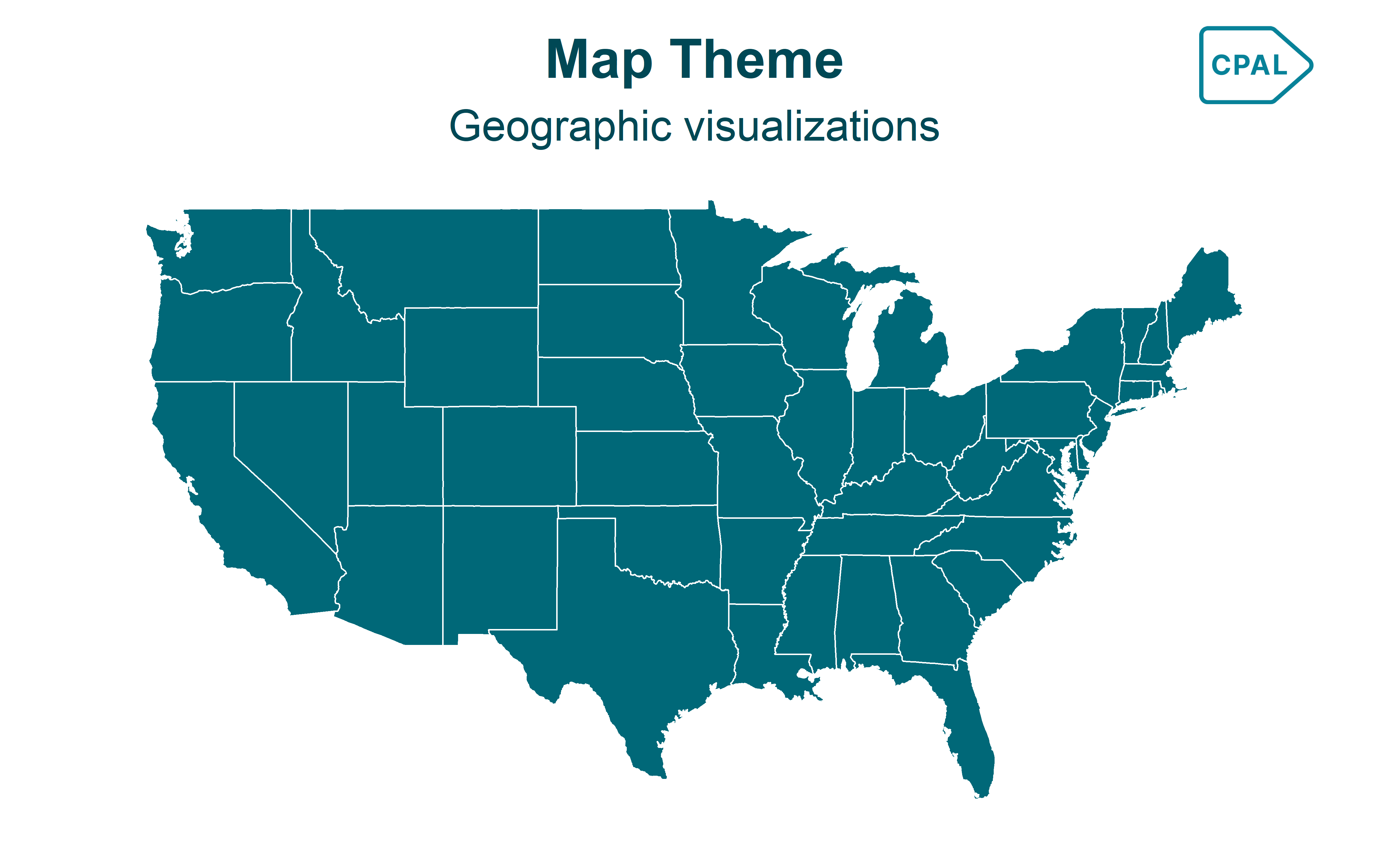
Side-by-Side Comparison
Use preview_cpal_themes() to compare all theme variants at once:
Show code
preview_cpal_themes()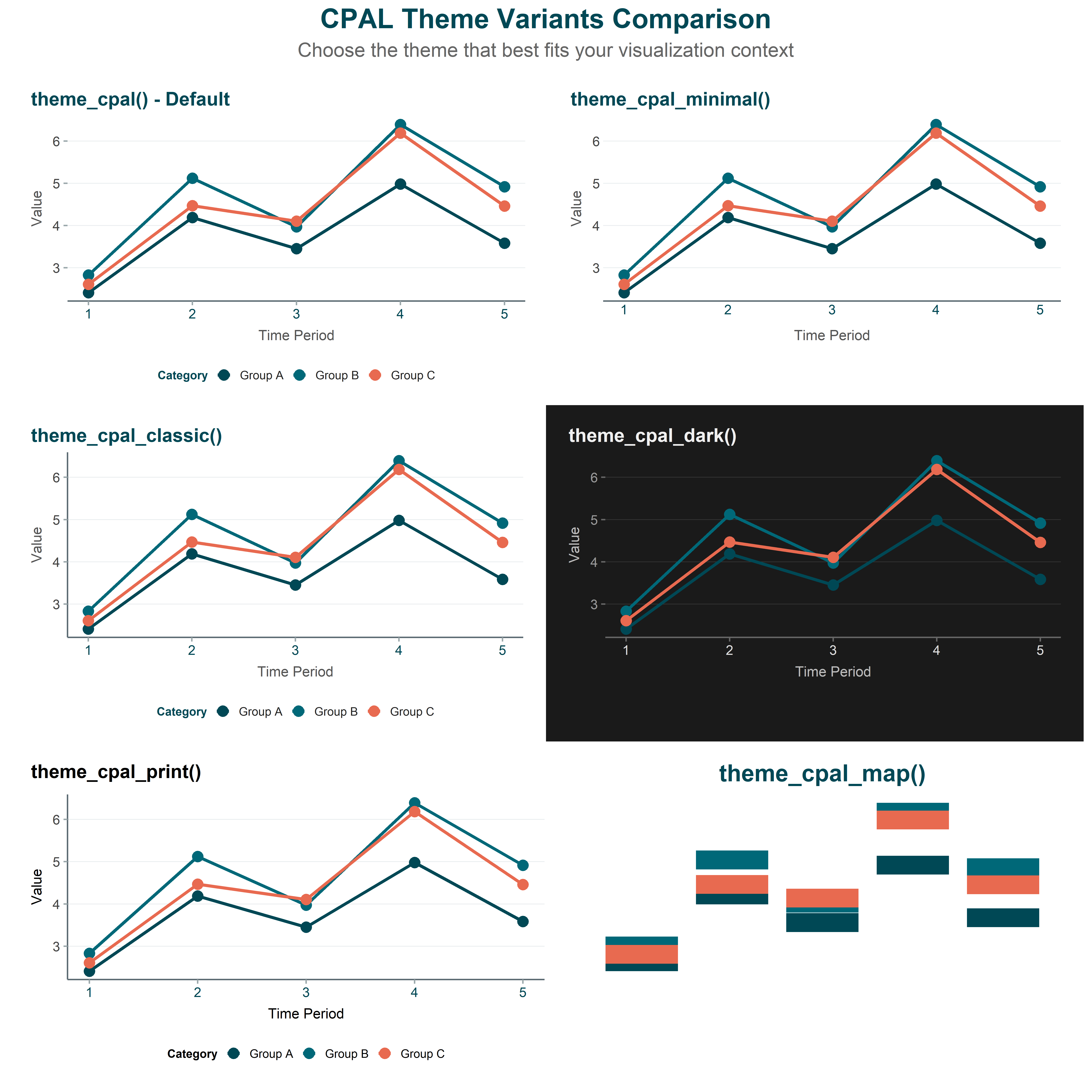
Theme Customization
All CPAL themes accept customization parameters. Here are the most commonly used options:
Base Size
Adjust the base font size (affects all text proportionally):
Show code
ggplot(mtcars, aes(x = wt, y = mpg)) +
  geom_point(color = "#006878", size = 3) +
  labs(title = "Larger Text for Presentations") +
  theme_cpal(base_size = 20)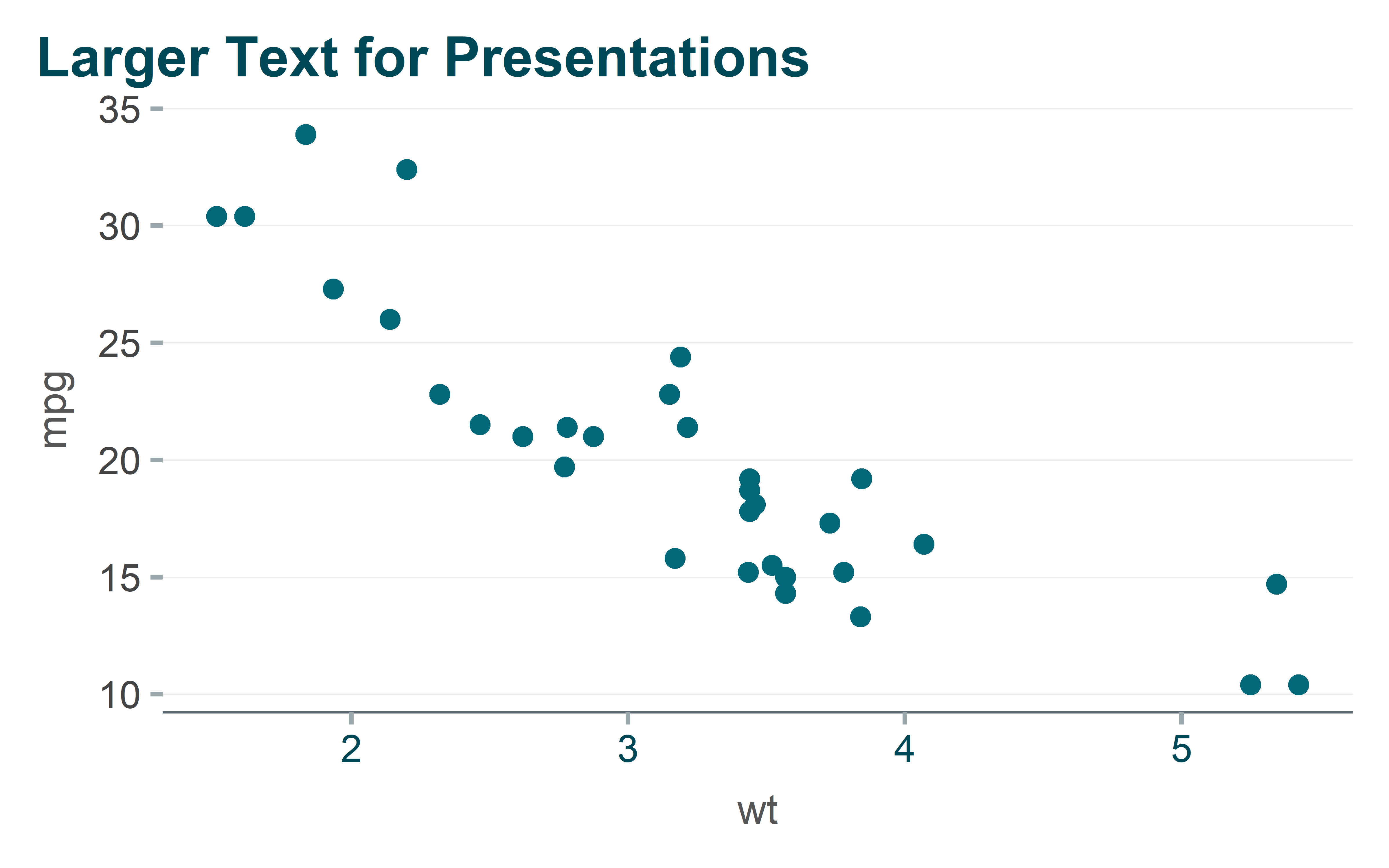
Grid Options
Control which gridlines appear:
Show code
ggplot(mtcars, aes(x = wt, y = mpg)) +
  geom_point(color = "#006878", size = 3) +
  labs(title = "Both Horizontal and Vertical Grid") +
  theme_cpal(grid = "both")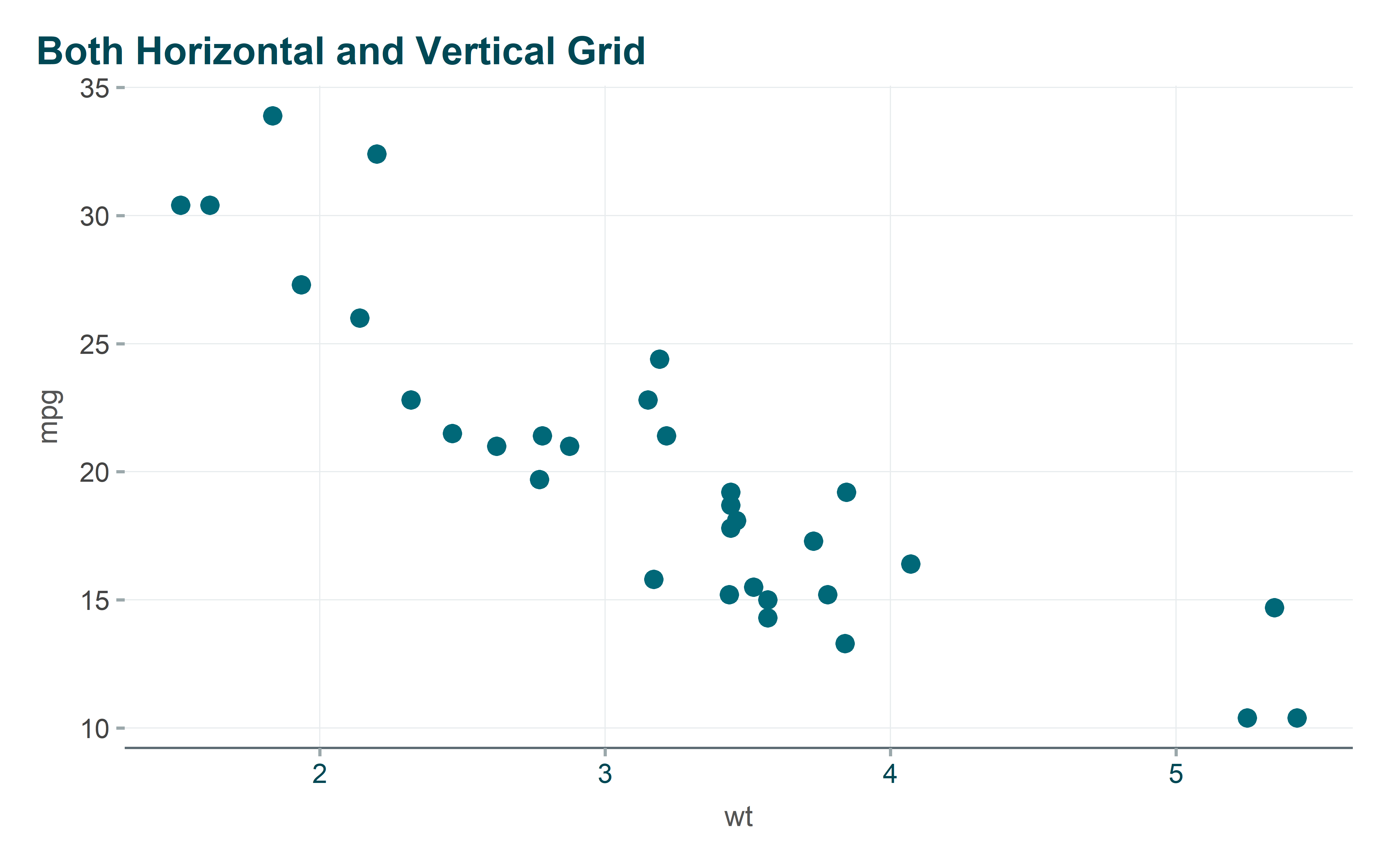
| Grid Option | Description |
|---|---|
"horizontal" |
Horizontal lines only (default) |
"vertical" |
Vertical lines only |
"both" |
Both horizontal and vertical |
"none" |
No gridlines |
See ?theme_cpal for full parameter documentation.
Adding the CPAL Logo
Always add the CPAL logo to final outputs using add_cpal_logo():
Show code
p <- ggplot(mtcars, aes(x = wt, y = mpg)) +
  geom_point(color = "#006878", size = 3) +
  labs(title = "Vehicle Fuel Efficiency", subtitle = "Motor Trend Car Road Tests") +
  theme_cpal()

add_cpal_logo(p)![]()
| Position | Description |
|---|---|
"top-right" |
Upper right corner (default) |
"top-left" |
Upper left corner |
"bottom-right" |
Lower right corner |
"bottom-left" |
Lower left corner |
Note
add_cpal_logo() automatically uses the white logo variant when it detects a dark theme.
Highcharter Themes
Highcharter creates interactive JavaScript visualizations perfect for web dashboards and Shiny applications. Users can hover for tooltips, zoom, pan, and download charts.
Applying the Theme
Use hc_cpal_theme() as a convenient one-stop function that applies the theme and sets US number formatting:
Show code
hchart(mtcars, "scatter", hcaes(x = wt, y = mpg, group = factor(cyl))) |>
  hc_cpal_theme() |>
  hc_colors_cpal() |>
  hc_title(text = "Fuel Efficiency by Weight") |>
  hc_xAxis(title = list(text = "Weight (1000 lbs)")) |>
  hc_yAxis(title = list(text = "Miles per Gallon")) |>
  hc_add_cpal_logo()
Theme Functions
| Function | Description |
|---|---|
hc_cpal_theme(hc, mode) |
Apply theme to chart (convenience function) |
hc_theme_cpal_light() |
Returns light mode theme object |
hc_theme_cpal_dark() |
Returns dark mode theme object |
Color Functions
Highcharter color functions ensure your interactive charts use CPAL brand colors consistently. These functions work similarly to the ggplot2 scale_*_cpal() functions but are designed for the Highcharts JavaScript library.
hc_colors_cpal() - Categorical Palettes
Use hc_colors_cpal() when your chart has discrete categories (e.g., grouped bar charts, multi-series line charts, pie charts). This function sets the color array that Highcharts cycles through for each series or category.
Show code
# Sample data with multiple categories
sales_data <- data.frame(
  quarter = rep(c("Q1", "Q2", "Q3", "Q4"), 3),
  region = rep(c("North", "Central", "South"), each = 4),
  sales = c(120, 150, 180, 200, 90, 110, 130, 160, 150, 170, 190, 220)
)

hchart(sales_data, "column", hcaes(x = quarter, y = sales, group = region)) |>
  hc_cpal_theme() |>
  hc_colors_cpal() |>
  hc_title(text = "Quarterly Sales by Region") |>
  hc_yAxis(title = list(text = "Sales ($K)")) |>
  hc_add_cpal_logo()
Available palettes:
| Palette | Description | Best For |
|---|---|---|
"main" |
Primary CPAL colors (default) | Most categorical data |
"secondary" |
Extended palette | Many categories (5+) |
"diverging" |
Two-tone scale | Comparing opposites |
Show code
# Use a specific palette
hchart(data, "pie", hcaes(name = category, y = value)) |>
  hc_colors_cpal("secondary")

# Limit to specific number of colors
hchart(data, "bar", hcaes(x = x, y = y, group = category)) |>
  hc_colors_cpal("main", n = 4)
hc_colorAxis_cpal() - Continuous Scales
Use hc_colorAxis_cpal() for visualizations where color represents a continuous numeric value, such as heatmaps, choropleth maps, or treemaps. This creates a smooth gradient between colors.
Show code
# Create heatmap data
heatmap_data <- expand.grid(
  day = c("Mon", "Tue", "Wed", "Thu", "Fri"),
  hour = c("9am", "12pm", "3pm", "6pm")
) |>
  mutate(value = round(runif(20, 10, 100)))

hchart(heatmap_data, "heatmap", hcaes(x = day, y = hour, value = value)) |>
  hc_cpal_theme() |>
  hc_colorAxis_cpal("sequential") |>
  hc_title(text = "Activity Heatmap") |>
  hc_legend(title = list(text = "Activity Level")) |>
  hc_add_cpal_logo()
Available continuous palettes:
| Palette | Description | Best For |
|---|---|---|
"sequential" |
Light to dark gradient | Values from low to high |
"diverging" |
Two-color gradient | Values with meaningful midpoint |
Formatting Helpers
| Function | Purpose |
|---|---|
hc_tooltip_cpal(decimals, prefix, suffix) |
Format tooltip values |
hc_yaxis_cpal(title, prefix, suffix, divide_by) |
Format y-axis labels |
hc_cpal_number_format() |
Set US number formatting (commas) |
Example with formatted tooltip and axis:
Show code
county_data <- data.frame(
  county = c("Dallas", "Tarrant", "Collin", "Denton"),
  population = c(2600000, 2100000, 1100000, 950000)
)

hchart(county_data, "bar", hcaes(x = county, y = population), name = "Population") |>
  hc_cpal_theme() |>
  hc_title(text = "North Texas County Population") |>
  hc_yaxis_cpal(title = "Population", suffix = "M", divide_by = 1000000) |>
  hc_tooltip_cpal(suffix = " residents") |>
  hc_add_cpal_logo()
Adding the CPAL Logo
The hc_add_cpal_logo() function adds CPAL branding to Highcharter outputs. The logo is positioned in the bottom-right corner by default and automatically renders as a clickable link to the CPAL website.
Basic Usage
Add the logo as the final step in your Highcharter pipeline:
Show code
trend_data <- data.frame(
  year = 2019:2024,
  rate = c(18.2, 19.1, 17.8, 16.5, 15.9, 14.8)
)

hchart(trend_data, "line", hcaes(x = year, y = rate), name = "Child Poverty Rate") |>
  hc_cpal_theme() |>
  hc_colors_cpal() |>
  hc_title(text = "Child Poverty Rate Trend") |>
  hc_subtitle(text = "Dallas County, 2019-2024") |>
  hc_yAxis(title = list(text = "Poverty Rate (%)"), min = 0) |>
  hc_xAxis(title = list(text = "Year")) |>
  hc_add_cpal_logo()
Light vs Dark Mode
The mode parameter controls which logo variant is used. Use "dark" when your chart has a dark background to ensure the logo remains visible:
Show code
hchart(trend_data, "area", hcaes(x = year, y = rate), name = "Child Poverty Rate") |>
  hc_cpal_theme("dark") |>
  hc_colors_cpal() |>
  hc_title(text = "Child Poverty Rate Trend (Dark Mode)") |>
  hc_yAxis(title = list(text = "Poverty Rate (%)"), min = 0) |>
hc_add_cpal_logo(mode = "dark")| Mode | Logo Variant | Use When |
|---|---|---|
"light" |
Dark logo (default) | Light/white chart backgrounds |
"dark" |
White logo | Dark chart backgrounds |
Dark/Light Mode Switching for Shiny
When building Shiny apps with dark/light mode toggles, use these reactive theme functions:
ggplot2:
Show code
# Direct switch based on input
output$plot <- renderPlot({
  ggplot(data, aes(x, y)) +
    geom_point() +
    theme_cpal_switch(input$dark_mode)  # "light" or "dark"
})

# Or create a reusable reactive theme
server <- function(input, output, session) {
  current_theme <- make_theme_reactive(input, toggle_id = "dark_mode")

  output$plot <- renderPlot({
    ggplot(data, aes(x, y)) +
      geom_point() +
      current_theme()
  })
}
Highcharter:
Show code
output$chart <- renderHighchart({
  hchart(data, "column", hcaes(x = x, y = y)) |>
    hc_cpal_theme(input$dark_mode) |>
    hc_add_cpal_logo(mode = input$dark_mode)
})
See Shiny Dashboards for complete examples.
Saving & Exporting
Once you’ve created your visualizations, you’ll need to export them for use in reports, presentations, emails, or web pages. The export format depends on your delivery method:
- Static images (PNG, PDF) - Best for documents, slides, print materials, and email attachments
- Interactive HTML - Best for web pages, stakeholder portals, and situations where users benefit from exploration
Saving ggplot2 Plots
Export ggplot2 visualizations as static image files when you need to embed charts in Word documents, PowerPoint presentations, PDF reports, or send them via email. Static images are universally viewable, don’t require special software, and maintain consistent appearance across all devices.
Use save_cpal_plot() for consistent output dimensions:
Show code
p <- ggplot(mtcars, aes(x = wt, y = mpg)) +
  geom_point(color = "#006878") +
  theme_cpal()

# Default size (8x5 inches)
save_cpal_plot(p, "plot.png")

# For presentations
save_cpal_plot(p, "slide.png", size = "slide")

# Custom dimensions
save_cpal_plot(p, "custom.png", size = c(10, 6))
Size Presets
| Preset | Dimensions | Use Case |
|---|---|---|
"default" |
8 x 5” | Standard reports |
"slide" |
10 x 5.625” | 16:9 presentations |
"half" |
4 x 3” | Half-width in reports |
"third" |
2.5 x 2” | Dashboard widgets |
"square" |
5 x 5” | Social media |
"wide" |
12 x 4” | Banners, headers |
"tall" |
5 x 8” | Infographics |
DPI Recommendations
| DPI | Use Case |
|---|---|
| 72 | Screen preview, quick drafts |
| 150 | Web images, email |
| 300 | Standard print, reports (default) |
| 600 | High-quality print, publications |
Show code
# High-resolution for print
save_cpal_plot(p, "print_quality.png", dpi = 600)

# Lower resolution for web
save_cpal_plot(p, "web_image.png", dpi = 150)
Exporting Highcharter as HTML
Export Highcharter visualizations as standalone HTML files when you want recipients to interact with the data—hovering for details, zooming into specific regions, or downloading the underlying data. This is ideal for sharing with stakeholders who want to explore the data themselves, embedding in web pages, or creating self-service data portals.
Unlike static images, HTML exports preserve all interactivity. Recipients can open the file in any web browser without needing R or special software installed.
Save interactive charts using htmlwidgets::saveWidget():
Show code
library(htmlwidgets)

chart <- hchart(mtcars, "scatter", hcaes(x = wt, y = mpg)) |>
  hc_cpal_theme() |>
  hc_title(text = "Interactive Chart") |>
  hc_add_cpal_logo()

# Save as self-contained HTML file
saveWidget(chart, "interactive_chart.html", selfcontained = TRUE)
The selfcontained = TRUE option embeds all JavaScript dependencies, making the file portable and shareable.
Accessibility
Why Accessibility Matters
CPAL visualizations should be accessible to all users, including those with visual impairments or color vision deficiencies. CPAL color palettes are designed with WCAG compliance in mind.
Checking Plot Accessibility
Use check_plot_accessibility() to analyze a plot for common accessibility issues:
Show code
p <- ggplot(mtcars, aes(x = wt, y = mpg, color = factor(cyl))) +
  geom_point(size = 3) +
  scale_color_cpal() +
  theme_cpal()

check_plot_accessibility(p)
=== CPAL Plot Accessibility Check ===
Text Size:
Base size: 14 pt
Status: OK PASS
Text size is adequate
Color Accessibility:
Using CPAL palette: NO No
Consider using CPAL color palettes which are colorblind-safe
Recommendations:
- Add descriptive titles and captions
- Consider using shapes/patterns in addition to colors
- Test with colorblindness simulators
- Provide alternative text descriptions for web/document useWhat it checks:
- Text size (minimum 10pt recommended)
- Color contrast against background
- Colorblind-safe palette usage
- Overall accessibility score
Next Steps
- Colors & Palettes - CPAL color system and scales
- ggplot2 Gallery - Static chart examples
- Highcharter Gallery - Interactive chart examples
- Shiny Dashboards - Dashboard theming